Category: Analyses

Zwischen Wissenschaft und Kriminalität: Geldautomatensprengungen in Rheinland-Pfalz & Hessen

In den vergangenen Jahren kommt es in der gesamten Bundesrepublik Deutschland immer wieder zu Geldautomatensprengungen. Das Bundeskriminalamt veröffentlicht hierzu jährlich ein Bundeslagebild, das sowohl deskriptive Statistiken als auch weitere Informationen zu den Vorfällen in den einzelnen Bundesländern bietet. Auch in meiner Heimatgemeinde Hünstetten wurde bereits mehrfach ein Geldautomat gesprengt und ausgeräumt. Für mich persönlich war dies unter anderem der Ursprung, sich dieses Phänomen einmal genauer mit Studierenden und im Kontext eines betreuten Lehrforschungsprojektes an der Hochschule Mainz anzuschauen.


© Beke Heeren-Pradt: Gesprengter Geldautomat in Hünstetten


Die Ergebnisse der umfangreicheren Untersuchung, die zusammen mit den Studierenden der Hochschule Mainz für das Land Rheinland-Pfalz durchgeführt wurde, sind jetzt in einer Open Access Publikation veröffentlicht. Im Fokus des Artikels stand nicht die Sprengung des Automaten an sich, sondern ein innovativer Lehransatz der anhand des Fallbeispiels die Geldautomatensprengungen untersucht. Die Studierenden haben bei ihren Untersuchungen auf der einen Seite versucht die Rolle der „Polizei“ und auf der anderen Seite die Rolle der „Räuber“ einzunehmen. Neben der Formulierung verschiedener Thesen zu dem genannten Fallbeispiel, umfasste das „Crime Mapping“ den größten Teil ihrer Analyse. Das bedeutet, beim „Crime Mapping“ geht es um die sogenannte Verbrechenskartierung und unter anderem um die Erkennung von Verbrechensmustern. Die folgende Abbildung zeigt zum Beispiel die gesprengten Geldautomaten (a) und Polizeidienststellen und deren Erreichbarkeit (b) in Rheinland-Pfalz.

Hintergrundkarte © OpenStreetMap Mitwirkende


Eine der vielen interessanten Thesen von den Studierenden konnte allerdings nicht bewiesen werden: „Beispielsweise ist die Polizeipräsenz auf dem Land zwar geringer, dies bedeutet aber nicht zwingend, dass dort im Vergleich die Geldautomaten gefährdeter sind.“ Der gesamte Artikel „Innovative Lehrmethoden in der GIScience am Beispiel von Crime Mapping mit Geldautomatensprengungen“ mit weiteren Abbildungen und Statistiken ist jetzt freizugänglich in der gis.Science abrufbar.

Die ersten Ergebnisse meiner Arbeit für das Land Hessen wurden daneben bereits Anfang 2023 in Zusammenarbeit mit Jan Eggers von der hessenschau veröffentlicht. Die Erkenntnis, die wir damals gewonnen haben, war wenig überraschend: In Hessen gibt es einen gewissen Zusammenhang zwischen der Häufigkeit von Sprengungen und einer guten Verkehrsanbindung.

© Jan Eggers


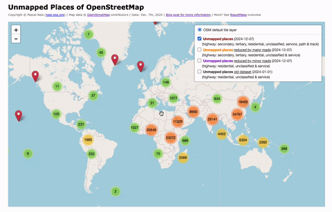
Unmapped Places of the OpenStreetMap World – 2024

In 2010, I first conducted a study which identified regions (places) in the OpenStreetMap (OSM) project in Germany that still had potential for more detailed mapping. Later, in 2016, this analysis was repeated and extended to the entire world. I have since regularly carried out these studies and published the results. The algorithm and some more details are documented in an earlier blog post of mine.

For the year 2024, I have recalculated this analysis and published the results on my website: “Unmapped Places of OpenStreetMap“. For the study, the OSM Planet File in PBF format from Dec. 7th was used. It can be downloaded here.

https://resultmaps.neis-one.org/unmapped

https://resultmaps.neis-one.org/unmapped


Currently, there are about 8.6 million elements in the OpenStreetMap project that use the place-key, representing either the center or the outline of a named place. Approximately 1.5 million place nodes are registered as villages, defined as “A village/town with up to 10,000 inhabitants.“. More details about the place-keys can be found in the OSM wiki. Depending on which type of street is used as a filter in my search, there are currently at least 170,000 places (villages) in OSM that are unmapped.

How is the number distributed across continents? Currently, 67% of the unmapped places are in Asia, followed by 30% in Africa. The remaining approx. 3 percent are distributed across the rest of the world. The detailed figures:

  • Asia: 113,895 (67%)
  • Africa: 51,443 (30%)
  • South America: 2,282
  • Oceania: 804
  • Europe: 637
  • North America: 484
  • Antarctica: 3

In the past the data from my studies have been used for MapRoulette, HOTOSM, MissingMaps, or similar mapathons or challenges. If anyone is interested in the individual layers of the visualization, they can be downloaded here directly as a JS file (track, minor, major). I would appreciate appropriate attribution if my data is used. Please feel free to leave a comment on my OSM diary page, where I have cross-posted this article.

Detecting vandalism in OpenStreetMap – A case study

This blog post is a summary of my talk at the FOSSGIS & OpenStreetMap conference 2017 (german slides). I guess some of the content might be feasible for a research article, however, here we go:

Vandalism is (still) an omnipresent issue for any kind of open data project. Over the past few years the OpenStreetMap (OSM) project data has been implemented in a number of applications. In my opinion, this is one of the most important reasons why we have to bring our quality assurance to the next level. Do we really have a vandalism issue after all? Yes, we do. But first we should take a closer look at the different vandalism types.

It is important to distinguish between different vandalism types. Not each and every unusual map edit should be considered as vandalism. Based on the OSM wiki page, I created the following breakdown. Generally speaking, vandalism can occur intentionally and unintentionally. Therefore we should distinguish between vandalism and bad-map-editing-behavior. Oftentimes new contributors make mistakes which are not vandalism because they do not have the expert mapper knowledge. In my opinion, only intentional map edits such as mass-deletions or “graffiti” are real cases of vandalism.

To get an impression of the state of vandalism in the OSM project, I conducted a case study for a four week timeframe (between January 5th and February 12th, 2017). During my study I analyzed OSM edits, which mostly deleted objects from new contributors who created fictitious data or changesets for the Pokemon game. If you did not hear or read about OSM’s Pokemon phenomena, you can read more about it here. The OSM wiki page for quality assurance lists some tools that can be used for vandalism detection. However, for this study I applied my own developed OSM suspicious webpage and the quite useful augmented OSM change viewer (Achavi). Furthermore, a webpage that lists the newest OSM contributors may also be of interest to you.

So what can you do when you find a strange map edit that could be a vandalism case? The OSM help page contains an answer for that. First of all: Keep calm! Use changeset comments and try to ask in a friendly manner for the suspicious mapping reasons.

Results of the study: Overall I commented 283 Changesets in the aforementioned timeframe of four weeks. Unfortunately I did not count the number of analyzed changesets, but I assume that it should be around 1,200 (+- 200). The following chart shows the commented changesets per day. The weekends tend to have a larger number of commented/discussed changesets.

As mentioned in the introduction of the vandalism types, we should distinguish between different vandalism types. The following image shows the numbers for each category. In my prototype study, 45% of the commented changesets were vandalism related and 24% have already been reverted which was not documented in the discussion of the changeset. Sometimes I also found imported test- and fictitious data, which the initial contributor of the changeset didn’t revert. It should be clarified to everyone that the live-database should never be used for testing purposes. Interested developers can use the test API and a test database (see sandbox for editing).

Responses and spatial distribution: Overall I received 70 responses for the discussed changesets, sadly only 20 from the owner/contributor of the changeset. But, more or less every response was in a friendly manner. Most often the contributors wrote “thank you” or “I didn’t know that my changes are going to be saved in the live database”. Furthermore, if I received a response, it was within 24 hours.

The following map contains some clustered markers. Each one highlights areas where the discussed changesets are located. As you can see on the map, the commented changesets are spread almost all over the world. In some areas they tend to correlate with the number of active OSM’ers. However, here is some additional information about three selected areas: 1: USA – Several cases of Pokemon Go related and fictitious map edits. 2: Japan/China – Some mass deletions and 3: South Africa – Oftentimes new MissingMaps or HOT contributors tend to delete and redraw more or less the same objects such as buildings. I guess it was not explained well enough to these editors that this destroys the object history? However, the article about “Good practice” in the OSM wiki is quite useful in this case.

Conclusion: The study reveals that there is an ongoing issue with vandalism in OSM’s map data. I think we do need to simplify the tools for detecting vandalism. In particular we should omit work where several users review identical suspicious map edits. Maybe the best possible solution should be a tool which is integrated directly in the OSM.org infrastructure. However, my presentation also contained some statistics and charts about the OSM changeset discussions feature. This will be the content of a separate blog post in following weeks. Also, the prototype introduced at the end of my talk will (hopefully) be presented in the next few months.

Thanks to maɪˈæmɪ Dennis.

A comparative study between different OpenStreetMap contributor groups – Outline 2016

Over the past few years I have written several blog posts about the (non-) activity of newly registered OpenStreetMap (OSM) members (2015, 2014, 2013). Similarly to the previous posts, the following image shows the gap between the number of registered and the number of active OSM members. Although the project still shows millions of new registrations, “only” several hundred thousand of these registrants actually edited at least one object. Simon showed similar results in his yearly changeset studies.

2016members

The following image shows, that the project still has some loyal contributors. More specifically, it shows the increase in monthly active members over the past few years and their consistent data contributions based on the first and latest changeset:

2016months

However, this time I would like to combine the current study with some additional research. I tried to identify three different OSM contributor groups, based on the hashtag in a contributor’s comment or the utilized editor, for the following analysis:

  1. Contributors of the MissingMaps-Project: A contributors of the project usually use #missingmaps in their changeset.
  2. Contributors that utilized the Maps.Me app: The ‘created_by’-tag contains ‘MAPS.ME’.
  3. All other ‘regular’ contributors of the OSM project, who don’t have any #missingmaps in their changesets and neither used the maps.me editor.

In the past 12 months, almost 1.53 million members registered to the OSM project. So far, only 12% (181k) ever created at least one map edit: Almost 12,000 members created at least one changeset with the #missingmaps hashtag. Over 70,000 used the maps.me editor and 99,000 mapped without #missingmaps and the maps.me editor. The following diagram shows the number of new OSM contributors per month for the three aforementioned groups.

2016permonth

The release of the maps.me app (more specifically the OSM editor functionality) clearly has an impact on the monthly number of new mappers. Time for a more detailed analysis about the contributions and mapping times: The majority of the members of the groups don’t show more than two mapping days (What is a mapping day, you ask? Well, my definition would be: A mapping day is day, where a contributor created at least one changeset). Only around 6% of the newly active members are contributing for more than 7 days.

2016mappingdays

Some members of the #missingmaps group also contributed some changesets without the hashtag. But many of those members (70%) only contributed #missingmaps changesets. Furthermore, 95% of this adjusted group doesn’t map for more than two days. Anyway, despite identifying three different contributor groups, the results are looking somewhat similar. Let’s have a look at the number of map changes. The relative comparison shows that the smaller #missingmaps group produces a large number of edits. The maps.me group only generates small numbers of map changes to the project’s database.

2016mapchanges

Lastly, I conducted an analysis for three selected tag-keys: building, highway and name. The comparison shows that the #missingmaps group generates a larger number of building and highway features. In contrast “regular” OSM’ers and maps.me users contributed more primary keys such as the name- or amenity-tag.

2016tags

I think the diagrams in this blog post are quite interesting because they show that the #missingmaps mapathons can activate members that contribute many map objects. But they also indicate that the majority of these elements are traced from satellite imagery without primary attributes. In contrast the maps.me editor functionality proofed to be successful with its in-app integration and its easy usability, which resulted in a huge number of new contributors. In summary, I think it would be good to motivate contributors not only to participate in humanitarian mapathons but also to map their neighborhood in an attempt to stick to the project. Also, I guess it would be great if the maps.me editor would work on the next steps in providing easy mapping functionality for its users (of course with some sort of validation to reduce questionable edits).

Thanks to maɪˈæmɪ Dennis.

Unmapped Places of OpenStreetMap – 2016

Back in 2010 & 2011 I conducted several studies to detect underrepresented regions a.k.a. “unmapped” places in OpenStreetMap (OSM). More than five years later, some people asked if I could rerun the analysis. Based on the latest OSM planet dump file and Taginfo, almost 1 million places have been tagged as villages. Furthermore, around 59 million streets have a residential, unclassified or service highway value. My algorithm to find unmapped places, works as follows:

  1. Use every place node of the OSM dataset which has a village-tag (place=village).
  2. Search in a radius of ca. 700 m for a street with one of the following highway-values: residential, unclassified or service.
  3. If no street can be found, mark the place as “unmapped”!

My results for the entire OSM planet can be found under the following webpage.

unmapped

Overall we have more than 440,000 unmapped places in OSM. As you can see in the picture above, most of the places are around Central Africa, Saudi Arabia or China. However, I hope that this analysis helps to complete some of the missing areas or to revise some incorrect map data. Some remarks about “false=positives” or why your village is marked as unmapped? Some possible reasons: Is the used tag for your place correct? Compare the wiki page for further information. Sometimes “hamlet” could be the correct tag value. Are the nearby highways tagged correctly? (OSM wiki)

Amount of unmapped places for each continent:

  • Africa 119,084
  • Asia 241,833
  • Australia 212
  • Europe 44,819
  • North America 16,464
  • Oceania 837
  • South America 15,576

Technical Stuff: The OSM data for the analysis is prepared by a custom OSM PBF reader. The webpage, which shows the results, is based on Leaflet 1.0.0-rc1 and the really fast PruneCluster plugin.

*Update*: You’ll find the date of the latest data update in the header -> “(Date: Apr. 9th, 2018)”

Thanks to maɪˈæmɪ Dennis.

OpenStreetMap Crowd Report – Season 2015

Almost one year has passed again. This means it’s time for the fourth OpenStreetMap (OSM) member activity analysis. The previous editions are online here: 2014, 2013 and 2012. Simon Poole already posted some interesting stats about the past few years. You can find all his results on the OSM wiki page. However, similar to last year, I try to dig a little deeper in some aspects.

Overall the OSM project has officially more than 2.2 million registered members (Aug, 9th 2015). For several of my OSM related webpages I create a personal OSM contributor database, based on the official OSM API v0.6. Anyway, when using this API, the final table will show a list with more than 3 million individual OSM accounts (Aug, 9th 2015). I’m not sure what the cause for this gap of almost 1 million members between the official number and the member number extracted with the API could be. Maybe some of you have a possible explanation? However, I think many accounts are created by spammers or bots.

The following chart shows a trend similar to the one of previous years: The project attracts a large number of newly registered members, but the sum of contributors that actively work on the project is fairly small. As mentioned in earlier posts, this phenomenon is nothing special for an online community project and has been analyzed for previous years already.

2015OSMMembers

Described in numbers (July 31st, 2015):

  • Registered OSM Members (OSM API): 3,032,954
  • Registered OSM Members (Official): 2,201,519
  • Members who created 1 Changeset: 562,670
  • Members who performed >= 10 Edits: 343,523
  • Members who created >=10 Changesets: 137,591

Personally, I really like the following diagram: It shows the increase in monthly contributor numbers over the past few years and their consistencies in collecting OSM data based on the first and latest contributed changeset of an OSM member. It’s great to see that at least some experienced mappers are still contributing to the project after more than five years.

2015OSMMembersSince

Some background information on how I created the stats: To retrieve the registration date of the members, I used the aforementioned OSM API. The other numbers are based on the OSM changeset dump, which is available for download here.

Next to the presented results above, you can find some daily updated statistics about the OSM project on OSMstats.

Thanks to maɪˈæmɪ Dennis.

Counting changes per Country – A different approach

OSMstats contains several statistics about the OpenStreetMap (OSM) project, such as daily-created objects, the amount of active contributors or detailed numbers for individual countries. One way to determine the sum of created or modified Node objects, is to use the minutely, hourly or daily OSM replication change files and counting the values for each country of the world. Sadly, this approach has some drawbacks. Firstly, the official files do not contain, for example, all Nodes of a modified way, which is required, when trying to find the country where the change took place. Furthermore, the determination of the country for a specific OSM object really depends on the border’s level of detail: More detailed country borders make the processing quite time-consuming. Some of you probably experienced this problem before when using Osmosis or a different OSM processing tool. Anyway, for calculating additional country statistics I tried a new approach:

  1. Determine the country of a changset based on its center position
  2. Use the changeset country information for all objects within this changeset.

map

Of course, the determined country of the changeset can “only” be generalized for the entire changeset content, but how does it compare with the current method utilized in OSMstats? I compared last week’s numbers of OSMstats for each country of the world with the newly introduced approach. In total, the number of active members per country differs for each weekday by around 3% (min. 1% and max. 5%). The average difference of created, modified and deleted Nodes per country is quite similar with 4% (min. 2% and max. 9%). The presented approach could produce partially incorrect results whenever a changeset contains border changes of two or more countries or if the center of the changeset is in the wrong country. But IMHO the assumption to use the changeset centers is sufficient to calculate results and determine changes per country. As you can see in the figure above, most OSM changesets happen in a manageable area within one country. Yes I know, exceptions prove the rule.

So, why am I doing this? The main idea behind this approach is to change the entire processing task for OSMstats within the coming weeks. The changes per country will then be based on the introduced approach. Another advantage will be, that this newly created information, gathered from the changesets, can be utilized to create additional contributor statistics.

Thanks to maɪˈæmɪ Dennis.

A précis: Where are the US mappers at?

This blog post is a summary of Dennis’ and my State of the Map (SotM) United States presentation. Maybe some of you already know about our publication: “Comparison of Volunteered Geographic Information Data Contributions and Community Development for Selected World Regions”. From the abstract: “Our findings showed significantly different results in data collection efforts and local OSM community sizes. European cities provide quantitatively larger amounts of geodata and number of contributors in OSM …”. “Furthermore, the results showed significant data contributions by members whose main territory of interest lies more than one thousand kilometers from the tested areas.” Especially the last finding is quite interesting when considering “arm-chair-mapping” in OSM.

However, for our SotM US session we repeated some of the conducted analyses for 50 urban areas in the United States to see whether similar patterns could be determined. You can find the session abstract here; additionally the ppt slides and also a video are online. The following animation shows the number of contributor’s evolution in the US from 2007 to 2014.

us_mapper_animation_tiny

Similar to our prior research results for the selected 12 world regions, the US urban areas showed different individual patterns. Some cities such as Fargo (ND) experienced several data imports in the past which resulted in strong data density values (Nodes and Ways), whereas other areas solely rely on a small community of volunteers and contributors.

We also conducted a simple statistical analysis to evaluate whether certain socio-economic factors have an impact on the development of OSM communities in the different cities. Variables such as population density, per capita income and education showed a moderate to strong correlation with contributor numbers, highlighting that all of the aforementioned factors can have an impact on the success of OSM in the selected urban areas in the US.

us_socio_economic_factors

It was also quite useful to take a look at the local contributor numbers vs. external contributors. Certain cities such as Miami (FL) heavily rely on data contributions made by mappers whose home region is more than 1000 km away, whereas other cities such as Los Angeles(CA) show large values for both, local and external mappers. You can check out your own area here too. The corresponding blog post is online here: “The OpenStreetMap Contributors Map aka Who’s around me?”. A more detailed analysis that is currently being conducted will reveal if cities that prove to have large external mapper contributions show the same quality as areas with lots of local mappers or not.


The State of the Map. United States. Street Network. 2013

Last year we wrote a journal paper in which we analyzed the OpenStreetMap (OSM) dataset of the United States which was published on May 28th, 2013 in the Transactions in GIS Journal. You can download a free pre-print version here. This paper has been published just on time to add to the discussion at the upcoming State of the Map United States conference which will take place in San Francisco and includes some presentations about data imports to OSM. Unfortunately, Dennis and I cannot attend the conference this year, so we decided to write a blog post with some additional and up-to-date numbers.

In January there was an announcement on the OSM mailing list that in the past few months many connectivity errors in the United States OSM dataset had been fixed. Probably a lot of these fixes can be attributed to Martijn’s Maproulette website or to Geofabrik’s OSM Inspector (OSMI) Routing View. However, a short discussion started on the mailing list about the total number of errors that are left and how long it would take to fix all those errors. Thus, we downloaded four OSM planet files dated Jan 4th 2012, June 13th 2012, Jan 2nd 2013 and Jun 2nd 2013 to get some new results. After cutting the United States dataset from the planet files, we used the same algorithm as utilized in OSMI’s Routing View, to receive some stats about the street network of the US datasets.

First of all the, the following image shows the number of errors for each dataset that we included in the analysis. The errors that were detected are separated into unconnected and duplicate ways. You can find some additional information about both error types here.

As you can see, the number of unconnected OSM ways has been rapidly reduced in the past 17 months from around 141,000 to 19,000. The number of “duplicate way” errors has been reduced from 17,500 to 11,500. You can find the exact numbers in the following table and an updated error layer on the mentioned OSMI website. In certain cases the duplicate way error created several errors for one and the same way. For these particular cases the number of unique OSM way IDs were counted.

Date – Unconnected Ways – Duplicate Ways

  • Jan 4th, 2012 – 141,578 – unique 17,563 (overall errors: 535,923)
  • June 13th, 2012 – 145,468 – unique 17,977 (overall errors: 518,536)
  • Jan 2nd, 2013 – 15,911 – unique 12,287 (overall errors: 257,388)
  • Jun 2nd, 2013 – 19,073 – unique 11,582 (overall errors: 220,451)

Overall the length of the US street network did not really change a lot. At the beginning of 2012 it was around 11.07 million km while in 2013 it is 11.1 million km, which means an increase of around 30,000 km. The following image shows the distribution of the US street network divided by different OSM road classes.

The length of the residential roads is still decreasing (-496,000 km), similar to what we saw during the analysis for our paper, while the length of the other road types (+276,000 km) and secondary/tertiary roads (+205,000 km) is increasing. This is the result of a massive retagging process of the imported TIGER/Line dataset in OSM. Dennis mentioned this already in his SotM US 2012 presentation. Motorways also experienced an increase of around +44,000 km in 2012. You will find some additional, quite interesting statistics, charts and of course maps in the aforementioned journal publication. In particular a few more thoughts and facts about the effect and impact of data imports on OSM can be found in our research study about the United States OSM dataset.

Introducing OpenStreetMap Contributor Activity Areas

One month ago I wrote a blog post about a new website which allows you to see other OpenStreetMap contributors in your area. Overall the feedback was very positive, thank you very much for that! However, now it is time for a new extension to the “How did you contribute to OpenStreetMap?” (HDYC) webpage. As I mentioned in my last blog post, I used an algorithm (which is described in a paper that I wrote here) to compute and determine the activity area of a contributor based on her/his changeset centers. The following figure shows the new function that was added to the HDYC website visualizing the activity area of a contributor! Sorry Harry, as always you have to be our guinea pig, but you have a really awesome activity area 🙂

Next to the visualization of the overall activity area of a contributor, you can also click on a link at the bottom of the map to switch to the contributors’ activity area of the past six months. Furthermore, all maps on HDYC now use the great Leaflet map library instead of Openlayers. Also, your activity areas’ first and last Nodes have a direct link to the “Overview of OpenStreetMap Contributors aka Who’s around me?” webpage. This provides an easy way to locate other contributors in your area. I have to mention that not every contributor has an activity area for the past six months. It highly depends on the activity of the contributor within this time frame!

One more thing: The aforementioned “Who’s around me?” webpage has three new overlays. Two overlays show the contributors of the past six months with their first and last Nodes and one additional layer shows the activity areas also based on the past six months for each contributor. You can find all new layers in the upper right corner in the so-called “Layerswitcher”.

My HDYC database is updated more or less on a daily basis. The information about your changeset activities is updated once a week (based on the weekly changeset dumps from here). “The Created Nodes per Country”-section can only be updated when a new full history dump is available, but you can always find the latest date in the section-label. The “Who’s around me?” webpage uses almost the same database as HDYC, so the data up-to-dateness is similar.

Have fun with the new gadgets!

¡Muchas gracias maɪˈæmɪ Dennis