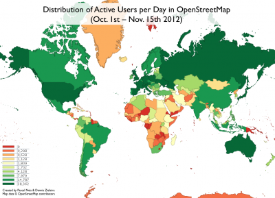
Two years ago, we created some maps which showed you the number of users per country for a timeframe of one month. Maybe some of you remember that the highest concentration of active contributors in relation to the countries’ population could be found in Europe. We thought it was about time to make some new maps to see if things have changed. The following map shows you the number of active contributors per day per country.
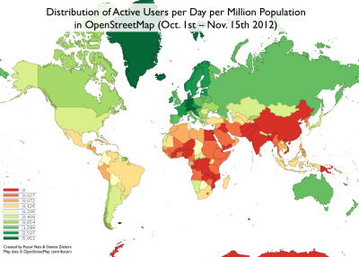
Similar to our results two years ago, the above map only gives some general information about the total number of users per country and does not consider the population for each country. Therefore we created a second map which shows you the relation between active users and the population in each country per day.
Overall the maps show a slightly similar activity pattern of the OSM users as in our previous results two years ago. The major concentration of the project still lies in Europe expanding more and more to the east. However, you can see certain changes in other areas of the world too. First improvements have been made in Africa, South America and South-East Asia. Greenland of course is looking quite exceptional due to the low population value.
So, what do you think? Where are you located and how would you describe the mapping activity development in your country?
***Update: Nov. 20th, 2012***


Comments
21 responses to “Distribution of Active Users in OpenStreetMap – Oct-Nov 2012”
neat. glad to see latvia looking better when population is taken into account 🙂
the difference between indonesia & papua new guinea is interesting – wondering whether hot has something to do with that
As somebody living in india, I shake my fist at you.
Nice 🙂
Much fairer view of OSM activity. Now all we need is a map of active users per amount of work left to do 🙂
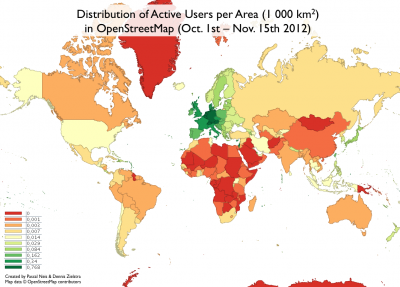
Could you also made a map with active users per Area?
Thanks for your comment. I added a new map which takes area in consideration.
happy to see that greenland wins in the per population chart 😉
poor China…
You can get arrested for drawing maps in China
Would be very nice to have area preserving maps (equiareal) like in the odbl.de statistics¹ because conformal maps are of no use in this scenario. Equiareal maps would make it much easier to imagine the ratio between mappers and countries inhabitants/area.
¹) http://odbl.de See at the middle of the main page.
In this example you get the astonishing insight of the real size of africa compared to small regions like USA, China or other well mapped European countries:
http://www.africaspotential.com/wp-content/uploads/true-size-of-africa1.jpg
That is why I think it is crucial to have equiareal maps in your stats.
Hi Wicking, thank you very much for your comment. I chose the Google Projection because it is familiar to most of the OSM members. So far I didn’t consider any equiareal maps. Anyway, I think for visualization purposes the Google Projection is fine. However, you are right, for a *real* comparison it would be better to use the “correct” projection, but I think it is not really “crucial”. Yes, Africa is huge compared to other areas but the activity is quite limited so far. Most OSM members probably know the sizes of the continents anyway 😉
Very nice charts… However I have a (small) doubt about validity of your Distribution of Active Users per Area.
I don’t have raw numbers and that might be an error on my part, but if we compare France and Finland
– France : active user ~ 40k (area 600km²)
– Finland : active user ~ 15k (area 340km²)
Roughly, the active user/km² should be about the same while we get x3 for France.
Have you compared to real km² ? There seam to be a distortion due to some merkator projection when you go farther north.
But that might be complete missunderstanding from my part 😉
Hi Sly, 40k for France and 15k *active* Users for Finnland? Sorry, but that can not be true 🙂 As you can see it in the maps, it’s about “daily active users” per country, population or area.
Hi pascal,
Maybe I should have a given a few more seconds when writing those 😉 Those figures are copied from your first chart but I thought the comma “,” was only used as the unit/decimal separator in french, and I thought it was the “thousand” separator in english.
So I guess your chart with 38,362 means 38.362 ~ 38 active users per day !
However, my comment takes into account the ratio between France and finlands, wich means it might still be true.
New comparison is :
– France : active user ~ 60 (between 38 and 76 in your chart ?) (area 600k km
) ~= 0.1 active user / 1000 km
– Finland : active user ~ 25 (between 15 and 38 in your chart?) (area 340k km
) ~= 0.07 active user / 1000 km
But your active user / 1000km
area chart shows :
0.34 for France
0.03 for Finland
Hi Sly,
Finnland has an average of 25 active contributors per day and France has an average of 232 contributors. You can’t look these values up in the legend of the map. The legend only provides the values/ranges of the classification schema that was used. It is not a table which represents each value of each individual country…
France has an area of 640k km2 and Finnland one of 304k km2 which means: 232/640 = 0,36 for France and 25/304 = 0,08 for Finnland
Let me know if you have any further questions? 🙂
> France has an average of 232 contributors.
That explains every thing 😉
By watching the legend of your first chart, I assumed the scale was built with a rule where each next step was roughly twice the previous one :
4->8 8->16 16->32
I then assumed since there wasn’t a 32->64 step that all “dark green colored countries” were between 32 and 64 wish was a wrong supposition.
The legend would be easier to understand with a :
0.3 and bellow = red
38.362 and more = dark green
(or new steps : 64, 128, 256 etc. for countries with lots of active mappers per day)
What do you mean by “Users”?
People who edit the map or people who just look at the OSM website?
As mentioned *in* the blog post text: “… active contributors …”
[…] creo varios mapas que muestran la distribución de la actividad de los mapeadores activos de OSM por país, población y […]
[…] ist zudem, dass man in Deutschland eine sehr aktive Gemeinschaft an Mappern hat, wenn man sich die Statistiken von Pascal Neis anschaut, wodurch wir hierzulande besonders stark von guten Karten profitieren. Es […]
[…] created several maps which show the distribution of active OSM mappers per country, population and […]