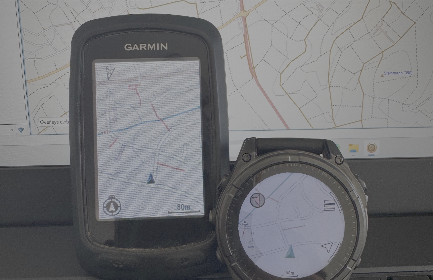
Tag: maps

Your Explored OSM World

Gregory Marler had the great idea to implement an “explored” map, based on a concept that some of you might know as “fog of war” from strategy video games. So here you go: I extended my OSM Heat Map with the “Explored Map Style”. It essentially reveals the contribution areas of an OpenStreetMap member in a “fog of war” style. The following figure shows Gregory’s amazing “explored” OSM map.

ExploredMapStyleToner

The Heat & Explored Maps are available for almost all OSM members who contributed at least several changesets here: http://yosmhm.neis-one.org (The new “Explored Map Style” can be selected in the layer panel (upper right corner). Additionally, I added the awesome looking and well known Watercolor and Toner map styles from Stamen design)

Thanks to maɪˈæmɪ Dennis

The OpenStreetMap Contributors Map aka Who’s around me?

The wait is over! As I mentioned in December, I have been working on an interactive online map, which shows you all volunteers of the OpenStreetMap world on a map. The first three layers contain the activity center of a contributor, her or his first created and latest modified node. The algorithm to determine the activity area of an OSM volunteer has been described in my publication here. I should mention that I used all changeset centers instead of all created nodes of a contributor. This way the computations don’t take as long and the process can be repeated every week based on the weekly OSM changeset dump.

The above image shows the created map for the center of London. As you can see, there are several Mapper-Types to choose from on the left side. Each mapper type is distinguished by the number of changesets that were created (shown in parentheses). However, most of the time you will see many orange or red figures on the map , which means that the OSM project has a lot of members who only made a few changes. This “issue” or “phenomenon” has also been mentioned in the publication.

Distribution of Active Users in OpenStreetMap – Oct-Nov 2012

Two years ago, we created some maps which showed you the number of users per country for a timeframe of one month. Maybe some of you remember that the highest concentration of active contributors in relation to the countries’ population could be found in Europe. We thought it was about time to make some new maps to see if things have changed. The following map shows you the number of active contributors per day per country.

Similar to our results two years ago, the above map only gives some general information about the total number of users per country and does not consider the population for each country. Therefore we created a second map which shows you the relation between active users and the population in each country per day.

I Like OpenStreetMap (OpenLayers Plugin)

A few months ago, Frederik Ramm posted an idea on the German OpenStreetMap mailing list about a new (stochastic) approach to OSM data quality assurance. You can find his original German post here. His idea was to create a way to allow users to “like” or “dislike” a specific region on the OSM map, a function that other popular websites such as YouTube or Facebook implemented to allow users to provide feedback to videos or status updates. For OSM this particular function could give some indicators or trends about the OSM map data.

I really liked his idea and in collaboration with Frederik I created an Open Source OpenLayers plugin. For all new readers: OpenLayers is an Open Source library which can implement a dynamic (OSM) map into more or less any webpage. One of our goals was to make the integration of the ILikeOSM plugin as easy as adding a tile server to your OpenLayers map.

OSM-“User”-WorldmapS

In the last post “current” OSM user activities per day, week and month were shown. The table providing the information of Users per Country was limited to the “TOP 16” and just a short timeframe. The following world map shows the amount of users per country for one month i.e. 10.05-10.06.2010

However, since this first map just gives some general information about the total amount of users per country and does not consider the population in each country, we made a second map that shows the relation between active users and the population in each country. To develop this map a so called “OSM-User-Ratio” has been created which includes the amount of OSM users per 1 million citizens for each country.

Next to the amount of users also the total amount of new nodes for each country were analyzed and can be seen in the following world map. The total amount of notes does not consider modified or deleted nodes.