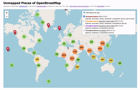
Category: Map

How to detect suspicious OpenStreetMap Changesets with incorrect edits?

Since its rise in popularity, the well-known online encyclopedia Wikipedia has been struggling with manipulation or, in the worst-case, vandalism attempts. Similarly, the OpenStreetMap (OSM) project suffered several times over the past few years of cases where incorrect map data edits were made. These erroneous edits can stem at times from (new) contributors or illegal data imports (or automated edits) which have not been discussed in advance with the community or the Data Working Group (DWG) and corrupted existing project data. The current OSM wiki page gives a great overview about general guidelines and e.g. types of vandalism. Another page in the wiki also mentions a prototype of a rule based system for the automatic detection of vandalism in OSM, which I developed in 2012. However, the system has never actually been implemented. Today, the contributors of OSM can use a variety of different tools to inspect an area or particular map changes. A few of them are listed below (complete list can be found here):

The State of the Map. United States. Street Network. 2013

Last year we wrote a journal paper in which we analyzed the OpenStreetMap (OSM) dataset of the United States which was published on May 28th, 2013 in the Transactions in GIS Journal. You can download a free pre-print version here. This paper has been published just on time to add to the discussion at the upcoming State of the Map United States conference which will take place in San Francisco and includes some presentations about data imports to OSM. Unfortunately, Dennis and I cannot attend the conference this year, so we decided to write a blog post with some additional and up-to-date numbers.

The OpenStreetMap Contributors Map aka Who’s around me?

The wait is over! As I mentioned in December, I have been working on an interactive online map, which shows you all volunteers of the OpenStreetMap world on a map. The first three layers contain the activity center of a contributor, her or his first created and latest modified node. The algorithm to determine the activity area of an OSM volunteer has been described in my publication here. I should mention that I used all changeset centers instead of all created nodes of a contributor. This way the computations don’t take as long and the process can be repeated every week based on the weekly OSM changeset dump.

The above image shows the created map for the center of London. As you can see, there are several Mapper-Types to choose from on the left side. Each mapper type is distinguished by the number of changesets that were created (shown in parentheses). However, most of the time you will see many orange or red figures on the map , which means that the OSM project has a lot of members who only made a few changes. This “issue” or “phenomenon” has also been mentioned in the publication.

Distribution of Active Users in OpenStreetMap – Oct-Nov 2012

Two years ago, we created some maps which showed you the number of users per country for a timeframe of one month. Maybe some of you remember that the highest concentration of active contributors in relation to the countries’ population could be found in Europe. We thought it was about time to make some new maps to see if things have changed. The following map shows you the number of active contributors per day per country.

Similar to our results two years ago, the above map only gives some general information about the total number of users per country and does not consider the population for each country. Therefore we created a second map which shows you the relation between active users and the population in each country per day.

OSM-GPS-Grid-Map

More than 6 weeks ago, I wrote a blog post about “Which country has the most OpenStreetMap GPS Points?“. You might remember that Russia and Germany provide the most OSM GPS points, as mentioned in the blog post.

Now, in a second step I created a worldwide grid, with an edge length of 15km, to show in more detail where the GPS points are located. The rendering of the tiles has been accomplished with the great TileMill software. Usually you would see some GPS noise in the grid cells above the equator. Thus, to eliminate this noise and to create a better overview, grid cells with less than 5 GPS points are made transparent. The following image shows an overview of Europe and the corresponding OSM GPS density. Of course you can also see some quite interesting and funny airplane, ferry or cruise routes.

However, I think the map overlay looks great and shows where the OSM GPS points are located. This information will also be published in the OSMatrix (thanks to Oliver Roick) within the next few days.