This blog post is a summary of Dennis’ and my State of the Map (SotM) United States presentation. Maybe some of you already know about our publication: “Comparison of Volunteered Geographic Information Data Contributions and Community Development for Selected World Regions”. From the abstract: “Our findings showed significantly different results in data collection efforts and local OSM community sizes. European cities provide quantitatively larger amounts of geodata and number of contributors in OSM …”. “Furthermore, the results showed significant data contributions by members whose main territory of interest lies more than one thousand kilometers from the tested areas.” Especially the last finding is quite interesting when considering “arm-chair-mapping” in OSM.
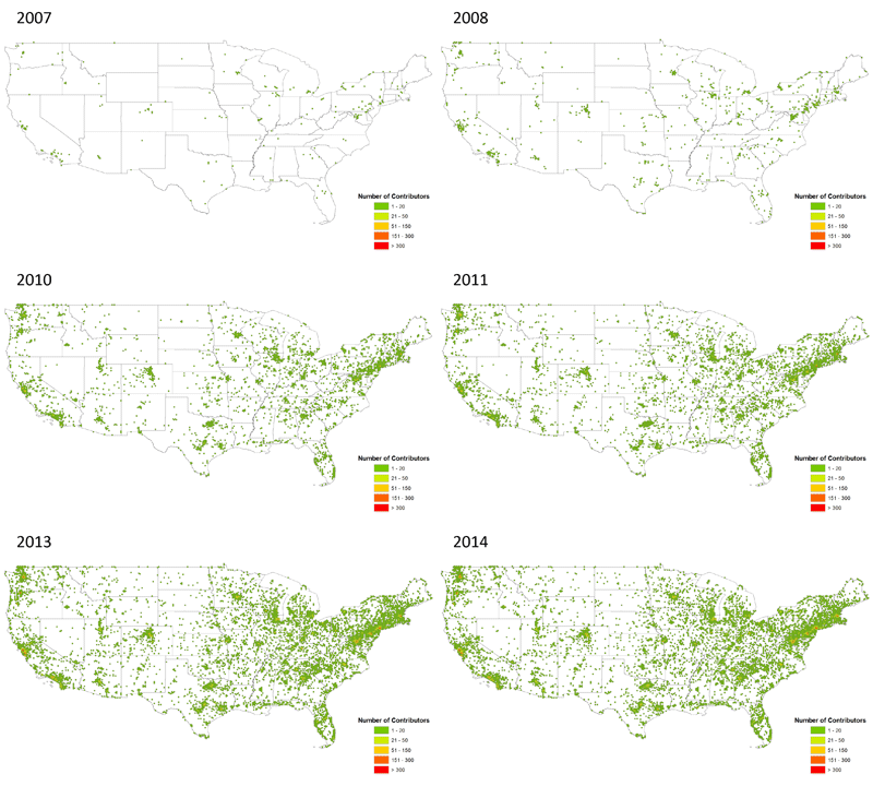
However, for our SotM US session we repeated some of the conducted analyses for 50 urban areas in the United States to see whether similar patterns could be determined. You can find the session abstract here; additionally the ppt slides and also a video are online. The following animation shows the number of contributor’s evolution in the US from 2007 to 2014.
Similar to our prior research results for the selected 12 world regions, the US urban areas showed different individual patterns. Some cities such as Fargo (ND) experienced several data imports in the past which resulted in strong data density values (Nodes and Ways), whereas other areas solely rely on a small community of volunteers and contributors.
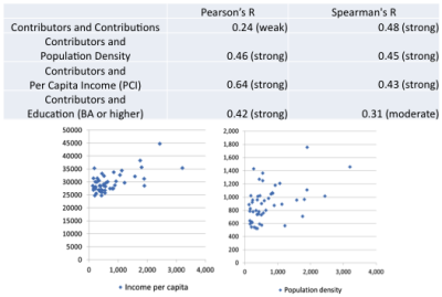
We also conducted a simple statistical analysis to evaluate whether certain socio-economic factors have an impact on the development of OSM communities in the different cities. Variables such as population density, per capita income and education showed a moderate to strong correlation with contributor numbers, highlighting that all of the aforementioned factors can have an impact on the success of OSM in the selected urban areas in the US.
It was also quite useful to take a look at the local contributor numbers vs. external contributors. Certain cities such as Miami (FL) heavily rely on data contributions made by mappers whose home region is more than 1000 km away, whereas other cities such as Los Angeles(CA) show large values for both, local and external mappers. You can check out your own area here too. The corresponding blog post is online here: “The OpenStreetMap Contributors Map aka Who’s around me?”. A more detailed analysis that is currently being conducted will reveal if cities that prove to have large external mapper contributions show the same quality as areas with lots of local mappers or not.

