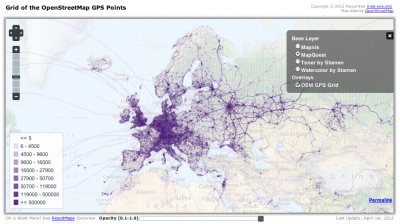
More than 6 weeks ago, I wrote a blog post about “Which country has the most OpenStreetMap GPS Points?“. You might remember that Russia and Germany provide the most OSM GPS points, as mentioned in the blog post.
Now, in a second step I created a worldwide grid, with an edge length of 15km, to show in more detail where the GPS points are located. The rendering of the tiles has been accomplished with the great TileMill software. Usually you would see some GPS noise in the grid cells above the equator. Thus, to eliminate this noise and to create a better overview, grid cells with less than 5 GPS points are made transparent. The following image shows an overview of Europe and the corresponding OSM GPS density. Of course you can also see some quite interesting and funny airplane, ferry or cruise routes.
However, I think the map overlay looks great and shows where the OSM GPS points are located. This information will also be published in the OSMatrix (thanks to Oliver Roick) within the next few days.
You can find my map here: http://resultmaps.neis-one.org/osmgps.html
PS: Below the map you will find a slider for the opacity of the GPS Grid Overlay, Enjoy!
thx @ maɪˈæmɪ Dennis for proofreading
thx @ *Fab* for creating the tiles/mapkey with MapBox’s TileMill

Comments
13 responses to “OSM-GPS-Grid-Map”
Does not work in Opera 11.61 and IE9.
Uih, thx! Should work now …
Really impressive…thanks for that!
It works, thanks!
[…] Pascal Neis created an OSM-GPS-Grid-Map based on all OSM-GPS-Points and TileMill. Read more in his blog post. […]
[…] Pascal Neis creo un OSM-GPS-Grid-Map basado en todos los Puntos-GPS-OSM y TileMill. Lee más en su artículo de blog aquí. […]
[…] Pascal Neis created an OSM-GPS-Grid-Map based on all OSM-GPS-Points and TileMill. Read more in his blog post. […]
What projection is this? Those hexagon bins are varied in actual size, as they don’t change size as you progress towards the poles. If you’re going to perform analysis with an emphasis on density, you need to employ an equal area projection for your grid. While the hexagons look cool, if they’re the same apparent size and shape as you move away from the equator, something’s wrong (or you’re looking at a globe.)
Hi John, thank you for your comment. The projection is EPSG:900913 (Spherical Mercator). I agree, for a “real” analysis it is much better to use an “equal-area projection”. But IMHO it is ok to use the current projection only for visualization purposes.
heya. the “blog post” link on http://resultmaps.neis-one.org/ for the grid map leads to the new contributor blog post 🙂
ooops, thx!
That’s a great visualisation of gps data around the world which can be used.
But it contans rather old data.
Would it be possible to refresh the content after nearly two years and keep on refreshing ?
Hi Werner, thx for your comment. Unfortunately, I don’t have the hardware ressources to update the map at the moment.